A six-color watercolor palette that mixes almost everything
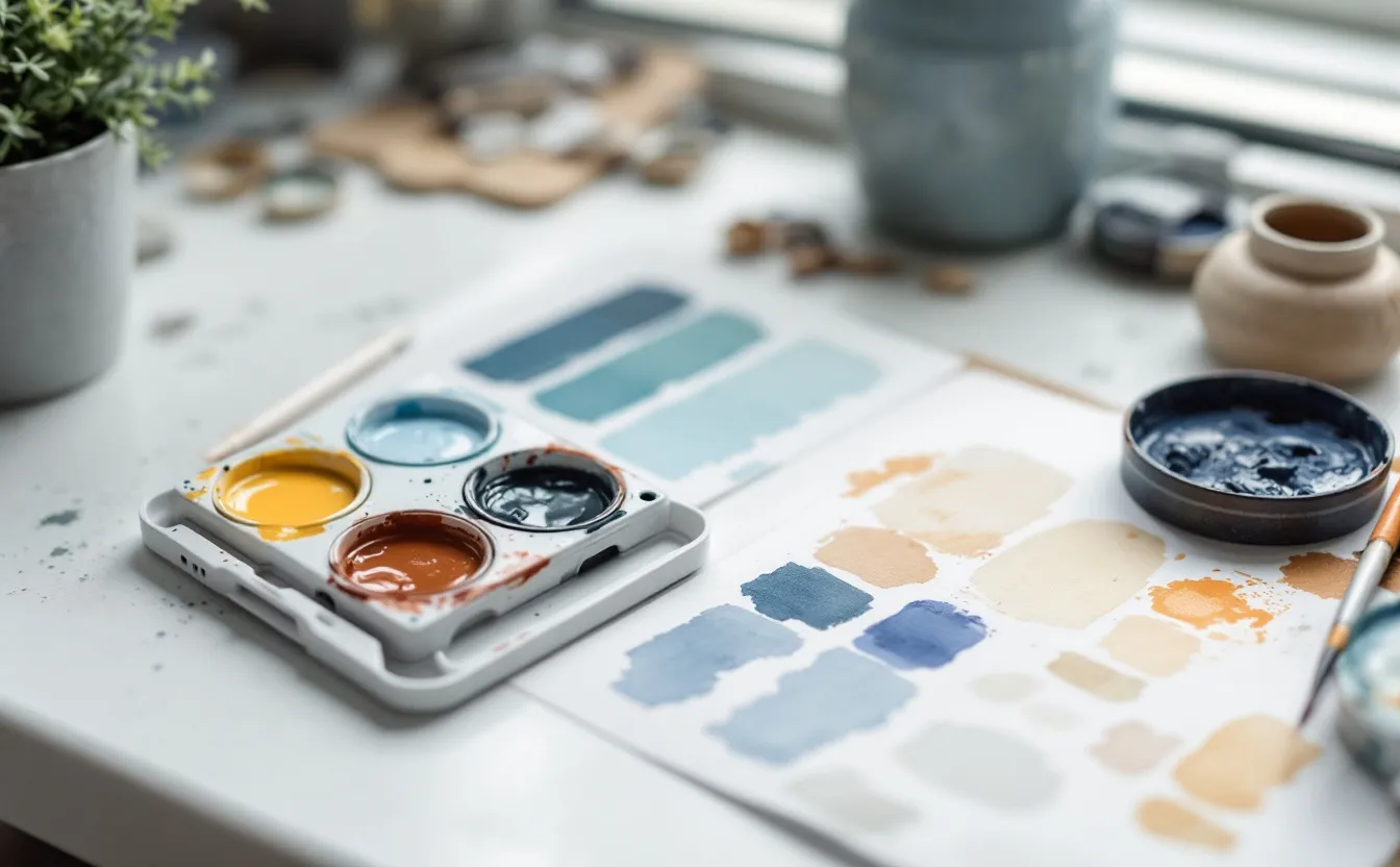
A box of thirty-six watercolors looks like freedom. In practice it often produces muddier paintings than a palette of six, because every new color brings its own quirks: different staining, different granulation, a different idea of what "green" means. Painters who work with a small, well-chosen palette learn their colors so thoroughly that they can mix almost anything on demand, and their paintings hang together because every color in them comes from the same family.
The classic small palette is the split primary: a warm and a cool version of each of the three primaries. Six tubes or pans, one mixing tray and a few hours of swatching, and you will understand color mixing better than most people who own the big box.
Why two of each primary
No real pigment is a pure primary. Every red leans slightly toward orange or toward violet; every blue leans toward green or toward violet; every yellow leans toward orange or toward green. Those leanings matter when you mix.
Mix a red that leans orange with a blue that leans green and you are effectively mixing all three primaries, because orange contains yellow and green contains yellow too. The result is a dull, brownish purple. Mix a red that leans violet with a blue that leans violet and both ingredients point the same way: you get a clean, bright violet.
The split primary palette gives you both options for every mix. Clean mixes come from colors that lean toward each other; muted, natural mixes come from colors that lean away. You choose which by picking the pair.
One version of the six
Exact pigments are a matter of taste and brand, but a common, reliable set looks like this. Pigment codes (PY for pigment yellow, PR for pigment red, PB for pigment blue and so on) are printed on most artist-quality tubes and are more useful than marketing names, which vary between makers.
| Role | Example pigment | Leans toward | Character |
|---|---|---|---|
| Cool yellow | Lemon or hansa yellow (PY3, PY175) | Green | Bright, slightly transparent |
| Warm yellow | New gamboge or a deep hansa (PY153, PY65, PY110) | Orange | Rich, warm |
| Warm red | Pyrrol scarlet or cadmium red (PR255, PR108) | Orange | Strong, fairly opaque |
| Cool red | Quinacridone rose or magenta (PV19, PR122) | Violet | Clean, transparent, staining |
| Warm blue | Ultramarine (PB29) | Violet | Granulating, gentle |
| Cool blue | Phthalo blue green shade (PB15:3) or cerulean (PB35, PB36) | Green | Intense, staining (phthalo) |
Many painters add one convenience earth, such as burnt sienna (PBr7) or a quinacridone gold, because it makes natural greens and grays quickly. That is a seventh color, and it is a good one, but try the six first so you know what the earth is saving you.
Setting out the palette
Arrange the colors around the edge of the palette in color-wheel order: cool yellow, warm yellow, warm red, cool red, warm blue, cool blue, back to cool yellow. Neighbors then mix cleanly, and colors across the palette from each other mix into neutrals. That arrangement makes the logic visible every time you pick up the brush.
Squeeze tube paint into the wells and let it dry overnight before a first session; dried watercolor rewets easily and wastes less. Keep the largest mixing area clean.
Mixing exercises
These exercises take an afternoon and leave you with a reference sheet you will use for years. Use a scrap of the same paper you normally paint on, since paper changes how color looks; the note on choosing watercolor paper explains why.
A mixing grid
Draw a grid of six by six squares. Write your six colors along the top and down the side in the same order. In each square, mix the two colors that meet there in roughly equal parts. The diagonal, where a color meets itself, is just that color at full strength.
You now have thirty-six mixes, many of them repeated in mirror image. Look at the clean greens where cool yellow meets cool blue, the dull olive where warm yellow meets warm blue, the bright violet where cool red meets warm blue. The grid shows you, in one glance, which pairs make clean color and which make earthy color.
Value strips
For each of the six colors, paint a strip that runs from full strength to the palest tint you can manage, by adding water in steps. Some pigments, especially yellows, never get very dark. Others, such as phthalo blue, are so strong that a tiny touch overwhelms a mix. Knowing the value range of each color tells you which ones can make shadows and which cannot.
Greens
Most painters struggle with greens, because tube greens look artificial in landscapes. Mix every combination of your two yellows and two blues, then try each mix with a touch of red to dull it. You will find a whole range: acid spring greens, deep conifer greens, gray-greens for distance. Label them and keep the sheet near your painting table.
Neutrals and grays
Mix complementary pairs (colors opposite each other on the wheel): ultramarine and burnt orange mixed from warm yellow and warm red, quinacridone rose and a green mixed from lemon and phthalo. Adjust the proportions until each mix is a neutral gray with no obvious color. Then push it warm or cool. These mixed grays are livelier than black, and they are what make a limited palette look sophisticated.
Using the palette in a painting
When you start painting with six colors, a few habits help:
- Mix more than you think you need, especially for large washes. Running out halfway and remixing rarely matches.
- Test each mix on a scrap before it touches the painting. Watercolor dries lighter; judge it dry.
- Keep clean water and dirty water in separate jars.
- Let the same mixes recur across the painting. A touch of the sky blue in the shadows, a touch of the foreground ochre in the clouds. That repetition is what makes a picture feel unified.
It can also help to paint the same small scene twice, once with your six colors and once with whatever you used before. Many people find the limited version calmer and more convincing even when it is less bright.
Testing a palette before you commit
Before buying six full tubes, many painters test a palette with small dot cards, sample sheets some makers offer, or with half-pans of artist-quality paint. Paint each candidate color in a strip from strong to pale, then make the key mixes: the greens, the violets, the grays. If a color does not earn its place in the mixes, swap it before you build the palette around it.
Pay particular attention to staining. Phthalo blue and quinacridone rose stain deeply and cannot easily be lifted; ultramarine and many earth colors lift more readily. A palette that mixes both staining and non-staining colors gives you a choice: stainers for glazes that must stay put, non-stainers for areas you may want to soften or lift later.
Once the six are chosen, keep them for at least a few months. Familiarity with a small palette is what makes it powerful. Every painting teaches you something about the same colors, and that knowledge adds up faster than any number of new tubes would.
Questions people ask
Do I need artist-grade paint for this?
Student paints work for practice, but they often use mixtures of pigments under one name, which makes mixing less predictable. A few artist-quality tubes with single-pigment codes give the cleanest results and last a long time.
Can I use the same idea with gouache?
Yes. A split primary set plus a strong white is a classic gouache palette, and the mixing logic is the same. The note on gouache vs watercolor explains how the paints differ in use.
When should I add more colors?
When you find yourself mixing the same color over and over and wishing it came in a tube, add that one. More notes on wet media are collected under watercolor and gouache.