Hot press, cold press or rough: matching surface to subject
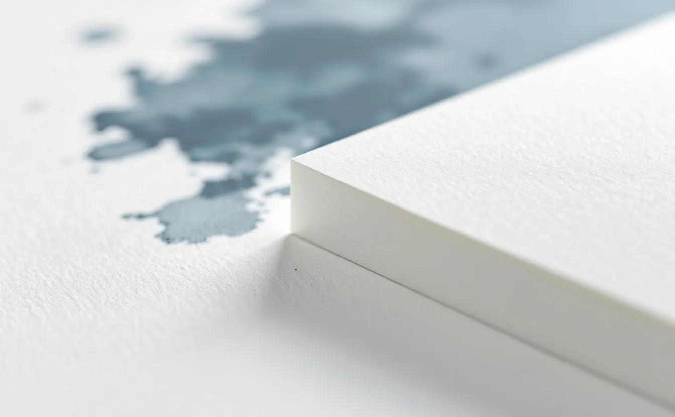
Pick up three sheets of watercolor paper of the same weight from the same maker, and they can feel like three different materials. One is smooth enough to write on with a fountain pen. One has a soft pebbly surface. One looks like a close-up of the moon. They are hot press, cold press and rough, and choosing between them changes your painting as much as choosing between colors.
The names describe how the sheets were finished. Hot pressed paper passes through heated metal rollers, which flatten and polish the surface. Cold pressed paper is pressed without heat, keeping a moderate texture. Rough paper is barely pressed at all after forming, so the full texture of the felts and the pulp remains. (In some countries, cold press is called "NOT", meaning not hot pressed.)
This note looks at what each surface does in practice, so you can match the paper to the subject in front of you.
What texture does to water and pigment
Texture works in two ways. It changes where pigment settles, and it changes how water moves.
On a smooth surface, there is nowhere for pigment to hide. It dries where the water leaves it, often with crisp edges and occasional tide lines (cauliflowers or blooms) where a wetter area pushes into a drying one. Washes stay bright, because pigment lies on top in an even film, but evenness is harder to achieve.
On a textured surface, pigment sinks into the valleys and leaves the peaks lighter. Granulating pigments, such as ultramarine and many earth colors, separate into speckles, which looks lively and natural. Water spreads more evenly because the texture slows and breaks up its flow. Small inconsistencies in your brushwork are disguised.
On a very rough surface, the effect is exaggerated. A loaded brush dragged across quickly skips over the valleys entirely, leaving white sparkles. That dry-brush texture is hard to get any other way.
Side by side
| Hot press | Cold press | Rough | |
|---|---|---|---|
| Surface | Smooth, satin | Moderate tooth | Pronounced texture |
| Washes | Dry with crisp edges; even washes are hard | Even, forgiving | Broken, granular |
| Fine detail | Excellent | Good | Difficult |
| Granulation | Subtle | Clear | Strong |
| Dry brush sparkle | Little | Some | Lots |
| Lifting | Easy (paint sits on top) | Moderate | Harder in the valleys |
| Combines with pen | Very well | Well | Pen catches and skips |
| Suits | Botanical, illustration, portraits, gouache, ink and wash | Landscapes, still life, most general work | Loose landscapes, water, stone, foliage |
Hot press
Hot press paper rewards control. A pointed round brush can paint the edge of a petal or the line of an eyelid exactly. Pen and ink lines stay sharp, which is why illustrators who combine ink with watercolor favor it. Colors look clean and saturated, and lifting out highlights with a damp brush is easier than on any other surface, because the paint has not sunk deep into the fibers.
The challenge is the wash. On smooth paper, every hesitation in a large wash shows as a hard edge. Painters who work on hot press often use more water, tilt the board, work quickly and accept, or plan for, some blooms. Many also work smaller on hot press, where large flat areas are less of an issue.
Gouache loves hot press for the same reason ink does: it gives flat, clean color fields. The note on what gouache is explains why opaque paint benefits from a smooth surface.
Cold press
Cold press is the default for good reason. It handles big washes well, shows granulation attractively, holds reasonable detail and forgives the small unevenness that all human brushwork has. If you are learning, or if you paint a bit of everything, cold press is the safest choice.
Texture varies between makers. One mill's cold press is close to hot press in feel; another's is almost rough. If a cold press sheet feels too smooth or too textured for you, try another brand before deciding the surface is wrong. The note on choosing watercolor paper covers fiber, weight and formats in more detail.
Rough
Rough paper is for painters who like the paper to have a voice. Skies granulate dramatically, a single dragged stroke becomes sparkling water, foliage builds itself out of broken marks. It suits loose, expressive work and larger formats, where the texture reads as atmosphere rather than noise.
It does not suit small detail, smooth gradations or flat graphic color, and pen lines skip across its hills. Some painters use a small sheet of rough only for studies of water and rock, because it does half the work.
Matching surface to subject
Some quick pairings, which are starting points rather than rules:
- Botanical studies, feathers, insects, anything with fine edges: hot press.
- Portraits in watercolor: hot press or a smooth cold press.
- Urban sketching with ink and wash: hot press or smooth cold press.
- General landscapes and still life: cold press.
- Seascapes, rivers, snow, stone walls, woodland: rough or a textured cold press.
- Big, loose skies: cold press or rough.
- Gouache illustration: hot press or bristol.
A test sheet worth making
Tear one sheet of each surface into strips. On each strip, paint four things: a flat wash, a graded wash, a granulating color (ultramarine with a touch of burnt sienna works well), and a dry-brush stroke. Then, once dry, lift a stripe from each with a damp brush and a tissue, and draw a pen line across all three.
Pin the three strips side by side above your table. It takes half an hour and answers most questions about which surface to buy next.
Sizing and the "two sides" question
Each surface also depends on sizing, the treatment that controls absorbency. A well-sized hot press sheet lets paint sit on the surface; a softly sized one absorbs faster and behaves more like cold press. That is one reason papers with the same label behave differently between brands.
Many papers also have a slightly different texture on each side. Some makers indicate the intended side with a watermark that reads correctly from the front. Both sides are usable; painters often prefer the slightly smoother back of a rough sheet, for instance, when they want texture without extremes.
Choosing for mixed work
Many people paint a little of everything and do not want three kinds of paper in the cupboard. If that is you, a few compromises work well. A smooth cold press, the kind some makers call "soft press" or a lightly textured cold press, handles detail almost as well as hot press while still forgiving large washes. Buying a block of cold press and a small pad of hot press covers almost every situation: the block for landscapes and general painting, the pad for botanical studies, portraits and ink and wash.
Sketchbooks complicate the picture. Most watercolor sketchbooks use cold press, and some offer hot press versions. If you sketch mainly with pen and add color, the hot press book will feel more natural. If you paint loose washes on location, cold press will be kinder.
Whatever you choose, stay with it long enough to learn it. Switching paper every week makes it hard to tell whether a painting went wrong because of your choices or because of the sheet.
Questions people ask
Is hot press harder for beginners?
For big washes, yes. For small, detailed subjects, many beginners find it easier, because detail behaves predictably. Try both before deciding.
Can I use rough paper for botanical painting?
You can, but fine detail will fight the texture. Rough suits loose flower studies better than precise botanical illustration.
Does texture change how colors look?
Yes. On rough and cold press, the white peaks scatter light and make washes look slightly lighter and more lively. On hot press, color looks denser and flatter. More notes on paper are collected under paper and materials.